When running a Pay-Per-Click (PPC) campaign, your landing page plays a critical role in converting visitors into leads or customers. This is especially true for service-based businesses where the primary goal is often to capture leads rather than make an immediate sale. An effective PPC landing page must be tailored to your audience’s needs and optimized to drive conversions.
Why Landing Pages Matter for PPC Campaigns?
Landing pages are specialized pages designed to receive traffic from your PPC ads. Unlike regular web pages, they are focused on a single objective, such as getting visitors to fill out a contact form, sign up for a newsletter, or request a service quote. The design and content of these pages are crucial for convincing visitors to take action.
When optimized correctly, a landing page can significantly improve the return on investment (ROI) of your PPC campaigns by increasing the percentage of visitors who convert into leads or customers.
Aligning the Landing Page with Your PPC Ad
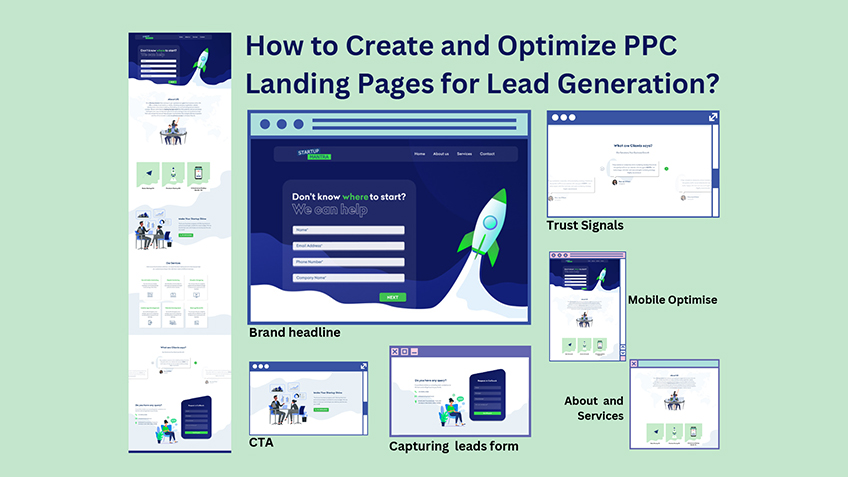
The first rule of a successful landing page is relevance. The content on your landing page should directly reflect the message of the PPC ad that brought the visitor there. For example, if your ad promotes a free consultation for legal services, your landing page should focus entirely on providing information about that consultation, with a clear path for visitors to schedule it.
Write a Clear and Attention-Grabbing Headline
Your headline is the first thing visitors see when they land on your page. It should be clear, simple, and directly related to your PPC ad. For example, if your ad says “Get a Free Legal Consultation,” your landing page headline could say “Free Legal Consultation—Get Expert Advice Today.” This immediately lets the visitor know they’re in the right place.
Create a Strong Call to Action (CTA)
The Call to Action (CTA) is the most important part of your landing page. It’s the button or link that tells visitors what to do next, like “Schedule Your Free Consultation,” “Get a Free Quote,” or “Sign Up Now.” Make sure your CTA is easy to find, stands out on the page, and is clear about what will happen when someone clicks it.
Keep the Design Simple and Focused
A simple, clean design helps visitors focus on your message and the CTA. Avoid cluttering the page with too much text or too many images. Everything on the page should help guide the visitor to the CTA. A clean design makes it easier for visitors to understand what you want them to do.
Add Trust Signals
Trust signals are things that make visitors feel safe and confident about your business. For example, you could include customer testimonials, logos of companies you’ve worked with, or badges showing your certifications. These elements help build trust and make visitors more likely to fill out your form or request your service.
Include a Simple Form for Capturing Leads
If your goal is to collect leads, make sure your form is easy to fill out. Only ask for the information you really need, like the visitor’s name and email address. The shorter and simpler the form, the more likely visitors are to fill it out. You can also offer something in return, like a free consultation or an eBook, to encourage visitors to complete the form.
Optimize for Mobile Devices
Many people will visit your landing page on their phones, so it’s important to make sure the page works well on mobile devices. This means the page should load quickly, the buttons should be easy to tap, and the form should be simple to fill out on a small screen. A mobile-friendly landing page helps ensure you don’t lose potential customers who are browsing on their phones.
Test and Improve Your Landing Page
Optimizing a landing page is not something you do just once. It’s important to keep testing different versions of your landing page to see what works best. For example, you can try different headlines, CTAs, or images to see which ones get more people to take action. Use the data you collect to make your landing page better over time.
Ready to Boost Your Business with High-Quality Leads and Genuine Growth?
As performance marketers, our goal is to maximize your return on investment (ROI) by generating high-quality leads and driving genuine business growth. Let me help you achieve your business goals with our tailored PPC strategies and expert insights.
Don’t miss out on the opportunity to elevate your marketing efforts and see real results.
Contact me– https://sahilkaul.com/
Hire me – https://www.upwork.com/freelancers/sahilkaul1996
What makes a good PPC landing page?
A good PPC landing page is relevant to the ad, has a clear and compelling CTA, a clean layout, trust signals, and a simple lead capture form. It should also be mobile-friendly and continuously optimized through testing.
How many fields should be in a lead capture form?
Ideally, a lead capture form should be as short as possible, asking for only the essential information like name, email, and perhaps one additional field like a phone number. The fewer fields, the higher the completion rate.
Why are trust signals important on a landing page?
Trust signals like testimonials, certifications, or guarantees help build credibility and reassure visitors that they are making a safe and smart choice, increasing the likelihood of conversion.
How often should I test my landing page?
Continuous testing is recommended. You should regularly run A/B tests on different elements like headlines, CTAs, and form placements to see what works best and make data-driven improvements.
Why is mobile optimization crucial for landing pages?
Far far away, behind the word mountains, far from the countries Vokalia and Consonantia, there live the blind texts. Separated they live in Bookmarksgrove right at the coast of the Semantics, a large language ocean.
If you're looking for any services regarding Digital Marketing or Website Developement, Please Contact now.


Leave a Comment